Magazine Cover Designs
Emma:

For my design, I chose to focus on the use of Empire Magazine as this is a well known production that would well advertise our film. I also thought the traditional red font of the magazine title would fit in well with the ideas that I had for it.
In my sketch I have included the magazine title at the top, and run the film title 'Wednesday's Child' across the middle of the cover. I have also included the traditional convention of a barcode, price and issue date on the bottom left. Along the bottom of the cover, I added a banner advertising smaller articles included in this issue of the magazine, and have included other titles at the edges of the page advertising the larger articles as typical of a film magazine.
The colour scheme that I imagine is mostly dark with the exception of the headings and the girl in the centre of the cover. Cohesive with our trailer, she would be depicted wearing red to demonstrate the danger, which will stand out against the dark surroundings. The cover in general will be very dark and full of shadows to portay the mystery-thriller genre.
Elizabeth:
My sketched design for the front cover of a magazine consisted of the basic conventions of any film magazine. Therefore, within my design I used the header and layout of the internationally-known film magazine 'Empire' since it would advertise our production very well and result in a wider audience income. The use of the colours of text throughout my design consists mainly of black, red and white. This fits in well with the red header of 'Empire' since it doesn't look out of place. I've included in my design an image of the main character, centred in the middle of the page so that the young girl looks lost withing the busy scenery surrounding her. I tried to use different locations that we used within our filming such as the trees, grass, leaves and muddy footprints from the forest, the pink rug from her girly bedroom, as the backing to make the character seem more eye catching since the blonde hair, pale skin, and red clothing signifying danger gives our audience clues to the mystery/thriller genre. I added the various traditional conventions such as a barcode, price, extra banners advertising other films coming soon, and a subheading 'Monday, Tuesday.. Child?' linking to our film, also by including '... child' instead of the actual name of the trailer adds even more tension, making our audience want to know more.
Emily:
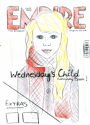
For my front cover I have tried to design an image that is in cohesion with our trailer. I have chosen Empire magazine to promote our film as its one of the biggest and successful magazines and would hopefully be the best choice in order to advertise our film. I am going to keep in the typical conventions of the magazine; using the red EMPIRE title with the tagline below, date and price between the M and a barcode. For my design I have chosen a close up image of our main character (Chloe) as the background, with our title 'Wednesday's Child' in the centre. I have also left a triangle shape in the bottom corner in order to place plugs as other extras within the magazine. When designing it I wanted to keep to a colour scheme which consists of: Red, white and grey tones.
posted by Emma C. at
Saturday, December 05, 2009
![]()

1 Comments:
an effective design which uses the striking image that dominates your trailer and meets some of the conventions of the Empire magazine front cover.
Post a Comment
Subscribe to Post Comments [Atom]
<< Home