Movie Posters
When advertising our product, we noticed the more variety of posters we have for our audience the better, since we can then have a wider audience income taking into consideration; sexuality, race, age, disability etc. Therefore within our group we all were allocated various memorable scenery and main characters from our teaser trailer to try and fit in every category above.
As you can see below, my final poster design is an image of 'Chloe' our main character within our teaser trailer.
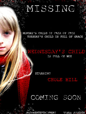
To create my poster i used Corel Paintshop Pro X3, which i was enable to edit the image of Chloe that i initially started off with, by addding text and color etc. Firstly i started off with a plain image of Chloe (the image shown below)

To get the image of Chloe looking vulnerable and innocent, I blacked out all the background scenery within the photo. With the pale skin and vibrant shade of blonde hair contrasting against the red scarf made Chloe stand out against the black backing making her eye catching.
I got the idea of displaying Chloe to the left hand side of the poster, from the 'Shutter Island' movie poster.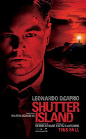 Since i thought it added tension and mystery to the character, also 'The Shutter Island' poster used the same colours as what our production consists of; red, black and white, this also let's the veiwer have an insight of what type of genred film it is, being a thriller/mystery. We thought as group, our posters should all consist of the same font being 'Courier new' on PC or 'American Typewriter' on the Mac. We decided to use these fonts since it links to liason officers because within films any investigators are stereotypically known to have a 'typewriter' or write in this text therefore we thought this would effective throughout our production. After adding the signifying text of the poem 'Monday's Child' linking to our film name 'Wednesday's Child', I used one the 'Artistic Brushes' to add smudges and dirtmarks around and on the text to make it look old and mysterious since it adds a bit of eeriness to the poster also linking back to the main charcter running away from the villin in the park, with her shoes getting muddy and dirty.
Paintshop includes various amounts of effects, such as 'skin smoothering' I used this to make Chloes skin glow and seem more pale than what it originally was, I also used this on the hair to blend into the black backing so the edges didn't look harsh.
As you can see below, my final poster design is an image of 'Chloe' our main character within our teaser trailer.

To create my poster i used Corel Paintshop Pro X3, which i was enable to edit the image of Chloe that i initially started off with, by addding text and color etc. Firstly i started off with a plain image of Chloe (the image shown below)

To get the image of Chloe looking vulnerable and innocent, I blacked out all the background scenery within the photo. With the pale skin and vibrant shade of blonde hair contrasting against the red scarf made Chloe stand out against the black backing making her eye catching.
I got the idea of displaying Chloe to the left hand side of the poster, from the 'Shutter Island' movie poster.
 Since i thought it added tension and mystery to the character, also 'The Shutter Island' poster used the same colours as what our production consists of; red, black and white, this also let's the veiwer have an insight of what type of genred film it is, being a thriller/mystery. We thought as group, our posters should all consist of the same font being 'Courier new' on PC or 'American Typewriter' on the Mac. We decided to use these fonts since it links to liason officers because within films any investigators are stereotypically known to have a 'typewriter' or write in this text therefore we thought this would effective throughout our production. After adding the signifying text of the poem 'Monday's Child' linking to our film name 'Wednesday's Child', I used one the 'Artistic Brushes' to add smudges and dirtmarks around and on the text to make it look old and mysterious since it adds a bit of eeriness to the poster also linking back to the main charcter running away from the villin in the park, with her shoes getting muddy and dirty.
Paintshop includes various amounts of effects, such as 'skin smoothering' I used this to make Chloes skin glow and seem more pale than what it originally was, I also used this on the hair to blend into the black backing so the edges didn't look harsh.
Labels: Elizabeth
posted by Elizabeth B at
Friday, March 12, 2010
![]()

1 Comments:
Excellent work ; a terrific account of the creative process and a really effective poster design. Well done. Target: C h l o e
Post a Comment
Subscribe to Post Comments [Atom]
<< Home