Magazine Front Cover
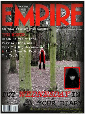
Again, we all focused on different images when creating our separate magazine covers. The image I focused on was a long shot of Chloe in the forest surroundings. I again used PaintShop Photo Pro X3, and to create a sense of cohesion, I used the same 'American Typewriter' font that we have used throughout our production, as well as keeping to the same colour scheme of black, white and red. I also brought out the colour of the trees with some green text at the bottom of the cover.
I also focused on keeping to the conventions of a magazine cover, and made sure that as well as the magazine title 'Empire', I included the date, price in GBP and USD, and a barcode at the bottom left corner.
I found that this specific image was hard to work with as the trees created certain lines through the image that couldn't be crossed by fonts and other images. For this reason, I chose to keep my magazine cover fairly simple with the subheadings surrounding 'Wednesday's Child' at the bottom of the page, and other subheadings on the left hand side. To create cohesion, I also included the image from my poster on the cover so that they were associated.
Here is my finished magazine front cover:
Labels: Emma
posted by Emma C. at
Monday, March 15, 2010
![]()

1 Comments:
Terrific work Emma, another convincing cover design that is cohesive and effective. Well done for creating a link to your poster and I love the Cover line 'Put Wednesday in your diary'.
Post a Comment
Subscribe to Post Comments [Atom]
<< Home