Magazine Front Cover
Again, within our group we all were allocated different pictures for our magazine cover, therefore my image was a mid photo shot of 'The Villain' wearing a black hoodie which is worn within our teaser trailer and looking up to the camera with an eerie star to his eyes. Looking like a stereotypical 'Yob' makes the audience think, what has he got? or what is he hiding underneath that hoodie of his?
 In the end i chose to do my magazine cover in style of Little White Lies Truth and Movies UK which is an independent film magazine and website company. That explores the various world's of music, art, politics, movies and pop culture, modernising the original forms and conventions of a film magazine such as 'Empire'.
Every issue of the magazine is set in style of 'Pop Art' giving an cartoon effect to the image.

Therefore I have tried to portray this within my poster since one of our researched films 'Gone Baby Gone' is included in one the issues of 'Little White Lies'.
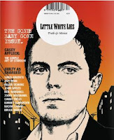
This image above is the 'Gone Baby Gone' issue of 'Little White Lies' it displays one of the main male characters who is an detective within the film trying to find a missing young girl. The magazine cover like every other 'Little White Lies' cover has been set in the style of pop art to create a pop cultural, vintage effect. It also includes a white circle in the top centre of the page with the bar code, cost, name of the magazine and website to advertise there product. The cover also includes the name of the film; 'GONE BABY GONE ISSUE' in typewriter styled writing, this is consistence throughout any 'Little White Lies' magazine, also sub headings for extras within the magazine have been included on front.Therefore I attempted my own version of a 'Little White Lies' cover for our teaser trailer.
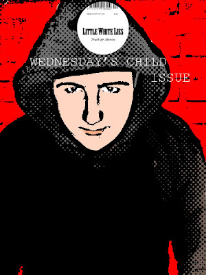 As you can see above, is my final magazine cover I created this by using Adobe Photoshop CS since Corel Paint shop Pro X3 didn't have the tools and effects i needed to make it in the style of 'Pop Art'. To do so I had to duplicate the original image, invert, blur and change the original blending mode, threshold which gave the image the black lining, colour dodge, add new layers to create the skin colour, eyes, lips, red backing and colour of hoodie, also to create the small dots, I filtered the image and added the effect halftone pattern this created the pop art style. On a new page I cropped and cut around the 'Little White Lies' circular logo and copied and pasted onto to my design and added the title of our film 'Wednesday's Child' by using the text button, I was able to pick the font 'Courier New' to make my design cohesive. One main problem with the text was that I couldn't overlay it on middle part of hoodie since i had added a black layer over it, so i had to place just below the 'Little White Lies' logo.
I thought my design really stands out since i kept to same colour arrangements; red, black and white to make it cohesive and fit with the other magazine covers that the other members of our group created. I decided to a use a red background since it makes the villain character look like he is has a red silhouette symbolising danger which is a signifier throughout our production.
 In the end i chose to do my magazine cover in style of Little White Lies Truth and Movies UK which is an independent film magazine and website company. That explores the various world's of music, art, politics, movies and pop culture, modernising the original forms and conventions of a film magazine such as 'Empire'.
Every issue of the magazine is set in style of 'Pop Art' giving an cartoon effect to the image.


Therefore I have tried to portray this within my poster since one of our researched films 'Gone Baby Gone' is included in one the issues of 'Little White Lies'.

This image above is the 'Gone Baby Gone' issue of 'Little White Lies' it displays one of the main male characters who is an detective within the film trying to find a missing young girl. The magazine cover like every other 'Little White Lies' cover has been set in the style of pop art to create a pop cultural, vintage effect. It also includes a white circle in the top centre of the page with the bar code, cost, name of the magazine and website to advertise there product. The cover also includes the name of the film; 'GONE BABY GONE ISSUE' in typewriter styled writing, this is consistence throughout any 'Little White Lies' magazine, also sub headings for extras within the magazine have been included on front.Therefore I attempted my own version of a 'Little White Lies' cover for our teaser trailer.
 As you can see above, is my final magazine cover I created this by using Adobe Photoshop CS since Corel Paint shop Pro X3 didn't have the tools and effects i needed to make it in the style of 'Pop Art'. To do so I had to duplicate the original image, invert, blur and change the original blending mode, threshold which gave the image the black lining, colour dodge, add new layers to create the skin colour, eyes, lips, red backing and colour of hoodie, also to create the small dots, I filtered the image and added the effect halftone pattern this created the pop art style. On a new page I cropped and cut around the 'Little White Lies' circular logo and copied and pasted onto to my design and added the title of our film 'Wednesday's Child' by using the text button, I was able to pick the font 'Courier New' to make my design cohesive. One main problem with the text was that I couldn't overlay it on middle part of hoodie since i had added a black layer over it, so i had to place just below the 'Little White Lies' logo.
I thought my design really stands out since i kept to same colour arrangements; red, black and white to make it cohesive and fit with the other magazine covers that the other members of our group created. I decided to a use a red background since it makes the villain character look like he is has a red silhouette symbolising danger which is a signifier throughout our production.
Labels: Elizabeth
posted by Elizabeth B at
Monday, March 15, 2010
![]()

1 Comments:
Wow! A creative and original design Lizzie that really evokes the style of your chosen magazine. Well done; you give a clear account of the difficult process.
Post a Comment
Subscribe to Post Comments [Atom]
<< Home