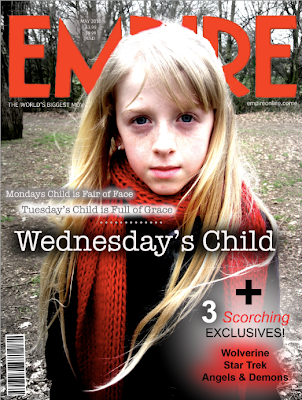
Magazine Front Cover

Above is my finished magazine front cover, which i made using Adobe PhotoShop CS4.
As a group we decided to choose different images to use for our magazine to widen our audience range. The image i used was a close up of our main character, Chloe. I thought that the close up was effective as you could see her emotion and created the feeling i was looking for.
I edited the image by using the saturation tool to enhance the red, also the brightness and shadows tool to make the image more darker to create cohesion with our production. This made Chloe look Innocent in horrible surroundings.
I kept to the typical conventions of Empire magazines by using the same red title, tagline that runs underneath the title, date and price between the 'M' and the website. I did this in order to keep my cover at a professional standard.
For the text i used quotes from the poem 'Mondays Child' which we also used within our trailer. I hoped that this would get remembered as it appears on both and would get easily recognised. I kept with the same font that we have used throughout each task 'American Typewriter'.
In my research i thought that it was important to create a colour scheme to make the cover look effective and at a high standards. I used the colours: Red, black and white which in cohesion with both the trailer and website.
Labels: Emily

1 Comments:
Excellent work Emily, a powerful design that uses the key conventions and packs a real punch with the close up and the saturation effects you have employed. A convincing and effective cover. Well done.
Post a Comment
Subscribe to Post Comments [Atom]
<< Home