Tuesday 30 March 2010

Wednesday's Child Teaser Trailer

Here is our completed teaser trailer for our multigeneric mystery/thriller Wednesday's Child:

Labels: , , ,

Wednesday 24 March 2010

iWeb

After realising the Mac's had a programme that would enable us to create a website, we explored the different features iWeb had to offer.

We looked through online tutorials on how to create basic pages, moving images and text to create our own content. After setting up a homepage on the programme, we realised that although the page templates were quite formal for the ideas we had in mind, it would be a lot easier to use this programme to create our homepage and then upload it to the domain bought by the school to hold our content.

Although I had started to create our homepage, first on an old version of Macromedia Dreamweaver, and then the newer version of Adobe Dreamweaver, it was relatively simple to trasnfer the images we wanted to use. Another bonus of using iWeb is that we can use the exact same font that is featured on our teaser trailer, DVD menu and our poster campaign. This will mean that our website homepage is extremely cohesive with the other components of our advertising campaign.

Labels:

Friday 19 March 2010

Viral Marketing - Starting Our Facebook Page

Whilst making our ancillary products, we decided that a good way to promote our film would be through viral marketing; Emily had previously researched this further. We decided that we would make our our Movie Page on http://www.facebook.com/ in which we would post details of the upcoming film, as well as different photos from the film to gain popularity.


To start with, I created the email account aandeeeentertainment@hotmail.co.uk so that we could set up our own facebook account to create the page. After some difficulties, Amy managed to create this page and add content to it so that we could begin to raise this online awareness.


We then began to promote this page through our own facebook accounts via status updates and on our friends walls. Our page began to gain popularity with our friends, and some of their friends also. This is a key example of the power of viral marketing and media in the online age.


Our facebook page can be viewed by clicking HERE.

Labels: ,

Tuesday 16 March 2010

Movie Poster


Above is my final film poster.

I created it using Jasc Paint Shop Pro version 9.00 as I have used this programme before and am familiar with the tools and methods used to create various image manipulations such as:


- Layering images to create different dimensions of the poster.

- Darkening colours, removing brightness and desaturating an image to create a negative representation of the villain.

- Creating two layers of the same image of our young female protagonist in order to at first darken one image slightly, and then to bring out the bright red of the scarf that is a main signifier of our film.

- Adding text, changing font styles, font sizes and font colours to create cohesion between all of our media products.


I chose to create my poster in this style as only one of our other posters uses the villain, and thought that creating the idea that he is standing in the shadows behind our young female protagonist, enabled me to portray both of the main characters that feature within our teaser trailer, and also gives away some indication of the types of character that feature within our main production.

Labels:

Monday 15 March 2010

Magazine Front Cover


Above is my finished magazine front cover, which i made using Adobe PhotoShop CS4.
As a group we decided to choose different images to use for our magazine to widen our audience range. The image i used was a close up of our main character, Chloe. I thought that the close up was effective as you could see her emotion and created the feeling i was looking for.
I edited the image by using the saturation tool to enhance the red, also the brightness and shadows tool to make the image more darker to create cohesion with our production. This made Chloe look Innocent in horrible surroundings.
I kept to the typical conventions of Empire magazines by using the same red title, tagline that runs underneath the title, date and price between the 'M' and the website. I did this in order to keep my cover at a professional standard.
For the text i used quotes from the poem 'Mondays Child' which we also used within our trailer. I hoped that this would get remembered as it appears on both and would get easily recognised. I kept with the same font that we have used throughout each task 'American Typewriter'.
In my research i thought that it was important to create a colour scheme to make the cover look effective and at a high standards. I used the colours: Red, black and white which in cohesion with both the trailer and website.

Labels:

Magazine Front Cover

Again, within our group we all were allocated different pictures for our magazine cover, therefore my image was a mid photo shot of 'The Villain' wearing a black hoodie which is worn within our teaser trailer and looking up to the camera with an eerie star to his eyes. Looking like a stereotypical 'Yob' makes the audience think, what has he got? or what is he hiding underneath that hoodie of his?
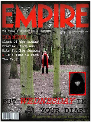
In the end i chose to do my magazine cover in style of Little White Lies Truth and Movies UK which is an independent film magazine and website company. That explores the various world's of music, art, politics, movies and pop culture, modernising the original forms and conventions of a film magazine such as 'Empire'.
Every issue of the magazine is set in style of 'Pop Art' giving an cartoon effect to the image.


Therefore I have tried to portray this within my poster since one of our researched films 'Gone Baby Gone' is included in one the issues of 'Little White Lies'.

This image above is the 'Gone Baby Gone' issue of 'Little White Lies' it displays one of the main male characters who is an detective within the film trying to find a missing young girl. The magazine cover like every other 'Little White Lies' cover has been set in the style of pop art to create a pop cultural, vintage effect. It also includes a white circle in the top centre of the page with the bar code, cost, name of the magazine and website to advertise there product. The cover also includes the name of the film; 'GONE BABY GONE ISSUE' in typewriter styled writing, this is consistence throughout any 'Little White Lies' magazine, also sub headings for extras within the magazine have been included on front.Therefore I attempted my own version of a 'Little White Lies' cover for our teaser trailer.
As you can see above, is my final magazine cover I created this by using Adobe Photoshop CS since Corel Paint shop Pro X3 didn't have the tools and effects i needed to make it in the style of 'Pop Art'. To do so I had to duplicate the original image, invert, blur and change the original blending mode, threshold which gave the image the black lining, colour dodge, add new layers to create the skin colour, eyes, lips, red backing and colour of hoodie, also to create the small dots, I filtered the image and added the effect halftone pattern this created the pop art style. On a new page I cropped and cut around the 'Little White Lies' circular logo and copied and pasted onto to my design and added the title of our film 'Wednesday's Child' by using the text button, I was able to pick the font 'Courier New' to make my design cohesive. One main problem with the text was that I couldn't overlay it on middle part of hoodie since i had added a black layer over it, so i had to place just below the 'Little White Lies' logo.

I thought my design really stands out since i kept to same colour arrangements; red, black and white to make it cohesive and fit with the other magazine covers that the other members of our group created. I decided to a use a red background since it makes the villain character look like he is has a red silhouette symbolising danger which is a signifier throughout our production.

Labels:

Magazine Front Cover

Again, we all focused on different images when creating our separate magazine covers. The image I focused on was a long shot of Chloe in the forest surroundings. I again used PaintShop Photo Pro X3, and to create a sense of cohesion, I used the same 'American Typewriter' font that we have used throughout our production, as well as keeping to the same colour scheme of black, white and red. I also brought out the colour of the trees with some green text at the bottom of the cover.


I also focused on keeping to the conventions of a magazine cover, and made sure that as well as the magazine title 'Empire', I included the date, price in GBP and USD, and a barcode at the bottom left corner.


I found that this specific image was hard to work with as the trees created certain lines through the image that couldn't be crossed by fonts and other images. For this reason, I chose to keep my magazine cover fairly simple with the subheadings surrounding 'Wednesday's Child' at the bottom of the page, and other subheadings on the left hand side. To create cohesion, I also included the image from my poster on the cover so that they were associated.


Here is my finished magazine front cover:


Labels:

Friday 12 March 2010

Movie Posters


For my poster design i decided to almost do a series.
I got this idea through my research, with the Coraline posters. I thought it was very effective and kept it fun and enjoyable for the audience. It also would build up suspense for each new poster.
I used, again, the lines from the poem 'Mondays Child' which is in our trailer and repeated on my magazine design to keep the posters ongoing.
The last poster i designed is typical of most posters with the actor/actress' name shown.
I also used our production company name and distributor.
To keep in cohesion with all the tasks i used the same colour scheme, font and style.

Labels:

Movie Posters

When advertising our product, we noticed the more variety of posters we have for our audience the better, since we can then have a wider audience income taking into consideration; sexuality, race, age, disability etc. Therefore within our group we all were allocated various memorable scenery and main characters from our teaser trailer to try and fit in every category above.

As you can see below, my final poster design is an image of 'Chloe' our main character within our teaser trailer.


To create my poster i used Corel Paintshop Pro X3, which i was enable to edit the image of Chloe that i initially started off with, by addding text and color etc. Firstly i started off with a plain image of Chloe (the image shown below)


To get the image of Chloe looking vulnerable and innocent, I blacked out all the background scenery within the photo. With the pale skin and vibrant shade of blonde hair contrasting against the red scarf made Chloe stand out against the black backing making her eye catching.

I got the idea of displaying Chloe to the left hand side of the poster, from the 'Shutter Island' movie poster. Since i thought it added tension and mystery to the character, also 'The Shutter Island' poster used the same colours as what our production consists of; red, black and white, this also let's the veiwer have an insight of what type of genred film it is, being a thriller/mystery. We thought as group, our posters should all consist of the same font being 'Courier new' on PC or 'American Typewriter' on the Mac. We decided to use these fonts since it links to liason officers because within films any investigators are stereotypically known to have a 'typewriter' or write in this text therefore we thought this would effective throughout our production. After adding the signifying text of the poem 'Monday's Child' linking to our film name 'Wednesday's Child', I used one the 'Artistic Brushes' to add smudges and dirtmarks around and on the text to make it look old and mysterious since it adds a bit of eeriness to the poster also linking back to the main charcter running away from the villin in the park, with her shoes getting muddy and dirty.

Paintshop includes various amounts of effects, such as 'skin smoothering' I used this to make Chloes skin glow and seem more pale than what it originally was, I also used this on the hair to blend into the black backing so the edges didn't look harsh.

Labels:

Movie Posters

As part of the advertising campaign made up of our main production and ancillary tasks, I have created one of the initial posters first attracting attention to our film. This poster is purposelly basic, including very little information and drawing in the audience to visit the website and find out more about the film itself. In our group, we all chose separate images to focus on so that our posters would not be too similar and would appeal to different audiences.


The image that I chose to focus on was that of the villain. He is not included so much in our teaser trailer, but to create cohesion he is wearing the same clothing, and using PaintShop Pro Photo X3, I have also dimmed the picture to create a darker feel to it. The white backed writing, in the cohesive 'American Typewriter' font shows the idea of text on ripped paper which I thought was fitting to our storyline and newspapers/police reports that we have looked into.


I have also incorporated the image of the scarf at the bottom of the poster. This brings in some of the key red colour that has been a huge focus throughout our production, as well as creating a sense of enigma and raising questions for all audiences.


Here is my final poster design:


Labels:

Monday 8 March 2010

Website Updates

When thinking about the areas that I would need to focus on to ensure that our own website will look professional, I looked through the ancillary task presentations created by my group, and also discussed with my group the things that we thought of as important to include in our own website. Eventually, we discovered that there are a few main areas that would need to be focused on to create an effective website for our production. These are as follows:

Images - Will need to include various different images ranging in shot types. I will also need to use an image editing programme such as Paint Shop Pro to create different image effects and to also build up an image of different layers to have an exiting and professional image.

Text - Will have to closely monitor the amount of text that appears on the website homepage. On most existing homepages, there is a very minimal amount of text used, so this research will reflect in my final homepage as this convention will have to be used. I will also look at the styles, colours and fonts of the text on the homepage, they will need to be the same throughout the website to create cohesion between each page making the final website effective and cohesive.

Hyperlinks - Websites contain hyperlinks, however, most professional websites use more comprehensive hyperlink styles. Image mapping is a method used to create different hyperlinks from different areas of the same image. I already have some basic knowledge of using image mapping and have decided to use image mapping on our website rather than using simple text links, as I think it will be a good way of making the website effective and professional, and will make the website of a higher standard.

HTML Formatting - Websites use HTML codes to create all different kinds of effects. Having some basic HTML knowledge, I thought it would be a good idea to use this knowledge to make the pages of our website more cohesive and professional. An example of the way I will be using HTML coding is by changing the colours of the scrollbars of the page. The colours I have selected are the same as the background colours, so this will make the scrollbars disappear, but will still scroll. This will make the website more professional as sometimes the presence of a scrollbar can change the overall look of the page.

Labels:

Friday 5 March 2010

iDVD

Whilst finishing our teaser trailer, to give it some authenticity, we decided to include a DVD menu with some special features. We found numerous software to create an opening to our DVD such as Microsoft Movie Maker which had some great features and ideas but we then resulted to using iDVD on Apple Mac.

iDVD, helped us customize our DVD. There were various amounts of themes to choose from to fit our genre of teaser trailer, from colours to fonts etc. We could add our own still photos and teaser trailer movie to the background, so our audience can view a snippet of the film making the viewer wanting to watch more.

We therefore chose to add to our DVD menu a close up image of our main character 'Chloe' in her symbolic red scarf, red shoes, pale skin and bright blonde hair. By adding a couple links also to our front page our viewers are able to look at different photos that were taken throughout the film and the main important link of teaser trailer. Also when entering our DVD menu the title of our trailer 'Wednesday's Child' scrolls across the bottom of the page in white lettering consisting of the same font throughout our media product 'American Typewriter'.

Labels:

Monday 1 March 2010

Photo Shoot

When looking into doing our ancillary tasks, we realised that we would need some new images as using ones from the film were just too poor quality. We wanted to use pictures for backgrounds and other smaller images so we needed some new, better quality photographs.

So i arranged a date with Chloe (our main character) to do a photo shoot. I took along props that we used within the film and also her original costume. I then shot various images in the locations that we chose.

I edited the photos by using the saturation tool to bring out the red and the light and shadow tool to make her and the background quite dull compared to the red.
After doing this we picked some of our favourite images:


Labels: