Saturday 8 May 2010

Candidates

A + Eee Entertainment candidates are as follows:


  • Emma Cottee (3051)
  • Amy Gallacher (3079)
  • Elizabeth Boulamatsis (3026)
  • Emily Wright (3234)

Labels: , , ,

Friday 7 May 2010

Evaluation - Emily Wright

Tuesday 4 May 2010

Evaluation - Elizabeth Boulamatsis

Evaluation - Amy Gallacher Candidate Number: 3079

After experimenting with different technical forms and styles of presentation, I have now finally completed my A2 evaluation.


Labels:

Monday 26 April 2010

Evaluation - Emma Cottee Candidate Number: 3051

As we came to the end of our course, we evaluated the whole process of planning and producing our teaser trailer and ancillary products. My evaluation is presented in the following powerpoint presentation:


(The original version of this presentation was in the cohesive American Typewriter font, however, http://www.authorstream.com/ would not recognise this font, and therefore I was forced to convert it to a more basic font type.)

Labels:

Saturday 24 April 2010

iWeb Completed Film Website

After changes in the programme used to create our website, I finally finished the site on iWeb. Below are the screenshots of the different pages.

I decided to create an enter page to the site as my individual research carried out at the beginning of the course showed how most film websites show the teaser trailer before following on to the homepage of the website. Here is the screenshot of the enter page, showing the teaser trailer, an image of our young female protagonist and a countdown to the release date. Keeping the fonts and colours the same as our other products enabled me to create cohesion amongst all of our merchandise.

Here is the homepage. It shows a menu at the top of the screen, with hyperlinks to each page. I used the same image of our female protagonist on the homepage and the enter page.

Homepage

Cast & Crew Page

Gallery Page

Teaser Trailer Page

Downloads Page

For the full website, follow this link.
After publishing our website online, we discovered that the font had changed. We realised this was due to the font we had originally used, "American Typewriter", was from the Mac and possibly is not compatible with the version Internet Explorer that we later viewed our website on. Our screenshots above show the true format of our fonts, displaying the cohesion between all of the texts we produced.

Labels:

Tuesday 30 March 2010

Wednesday's Child Teaser Trailer

Here is our completed teaser trailer for our multigeneric mystery/thriller Wednesday's Child:

Labels: , , ,

Wednesday 24 March 2010

iWeb

After realising the Mac's had a programme that would enable us to create a website, we explored the different features iWeb had to offer.

We looked through online tutorials on how to create basic pages, moving images and text to create our own content. After setting up a homepage on the programme, we realised that although the page templates were quite formal for the ideas we had in mind, it would be a lot easier to use this programme to create our homepage and then upload it to the domain bought by the school to hold our content.

Although I had started to create our homepage, first on an old version of Macromedia Dreamweaver, and then the newer version of Adobe Dreamweaver, it was relatively simple to trasnfer the images we wanted to use. Another bonus of using iWeb is that we can use the exact same font that is featured on our teaser trailer, DVD menu and our poster campaign. This will mean that our website homepage is extremely cohesive with the other components of our advertising campaign.

Labels:

Friday 19 March 2010

Viral Marketing - Starting Our Facebook Page

Whilst making our ancillary products, we decided that a good way to promote our film would be through viral marketing; Emily had previously researched this further. We decided that we would make our our Movie Page on http://www.facebook.com/ in which we would post details of the upcoming film, as well as different photos from the film to gain popularity.


To start with, I created the email account aandeeeentertainment@hotmail.co.uk so that we could set up our own facebook account to create the page. After some difficulties, Amy managed to create this page and add content to it so that we could begin to raise this online awareness.


We then began to promote this page through our own facebook accounts via status updates and on our friends walls. Our page began to gain popularity with our friends, and some of their friends also. This is a key example of the power of viral marketing and media in the online age.


Our facebook page can be viewed by clicking HERE.

Labels: ,

Tuesday 16 March 2010

Movie Poster


Above is my final film poster.

I created it using Jasc Paint Shop Pro version 9.00 as I have used this programme before and am familiar with the tools and methods used to create various image manipulations such as:


- Layering images to create different dimensions of the poster.

- Darkening colours, removing brightness and desaturating an image to create a negative representation of the villain.

- Creating two layers of the same image of our young female protagonist in order to at first darken one image slightly, and then to bring out the bright red of the scarf that is a main signifier of our film.

- Adding text, changing font styles, font sizes and font colours to create cohesion between all of our media products.


I chose to create my poster in this style as only one of our other posters uses the villain, and thought that creating the idea that he is standing in the shadows behind our young female protagonist, enabled me to portray both of the main characters that feature within our teaser trailer, and also gives away some indication of the types of character that feature within our main production.

Labels:

Monday 15 March 2010

Magazine Front Cover


Above is my finished magazine front cover, which i made using Adobe PhotoShop CS4.
As a group we decided to choose different images to use for our magazine to widen our audience range. The image i used was a close up of our main character, Chloe. I thought that the close up was effective as you could see her emotion and created the feeling i was looking for.
I edited the image by using the saturation tool to enhance the red, also the brightness and shadows tool to make the image more darker to create cohesion with our production. This made Chloe look Innocent in horrible surroundings.
I kept to the typical conventions of Empire magazines by using the same red title, tagline that runs underneath the title, date and price between the 'M' and the website. I did this in order to keep my cover at a professional standard.
For the text i used quotes from the poem 'Mondays Child' which we also used within our trailer. I hoped that this would get remembered as it appears on both and would get easily recognised. I kept with the same font that we have used throughout each task 'American Typewriter'.
In my research i thought that it was important to create a colour scheme to make the cover look effective and at a high standards. I used the colours: Red, black and white which in cohesion with both the trailer and website.

Labels:

Magazine Front Cover

Again, within our group we all were allocated different pictures for our magazine cover, therefore my image was a mid photo shot of 'The Villain' wearing a black hoodie which is worn within our teaser trailer and looking up to the camera with an eerie star to his eyes. Looking like a stereotypical 'Yob' makes the audience think, what has he got? or what is he hiding underneath that hoodie of his?
In the end i chose to do my magazine cover in style of Little White Lies Truth and Movies UK which is an independent film magazine and website company. That explores the various world's of music, art, politics, movies and pop culture, modernising the original forms and conventions of a film magazine such as 'Empire'.
Every issue of the magazine is set in style of 'Pop Art' giving an cartoon effect to the image.


Therefore I have tried to portray this within my poster since one of our researched films 'Gone Baby Gone' is included in one the issues of 'Little White Lies'.

This image above is the 'Gone Baby Gone' issue of 'Little White Lies' it displays one of the main male characters who is an detective within the film trying to find a missing young girl. The magazine cover like every other 'Little White Lies' cover has been set in the style of pop art to create a pop cultural, vintage effect. It also includes a white circle in the top centre of the page with the bar code, cost, name of the magazine and website to advertise there product. The cover also includes the name of the film; 'GONE BABY GONE ISSUE' in typewriter styled writing, this is consistence throughout any 'Little White Lies' magazine, also sub headings for extras within the magazine have been included on front.Therefore I attempted my own version of a 'Little White Lies' cover for our teaser trailer.
As you can see above, is my final magazine cover I created this by using Adobe Photoshop CS since Corel Paint shop Pro X3 didn't have the tools and effects i needed to make it in the style of 'Pop Art'. To do so I had to duplicate the original image, invert, blur and change the original blending mode, threshold which gave the image the black lining, colour dodge, add new layers to create the skin colour, eyes, lips, red backing and colour of hoodie, also to create the small dots, I filtered the image and added the effect halftone pattern this created the pop art style. On a new page I cropped and cut around the 'Little White Lies' circular logo and copied and pasted onto to my design and added the title of our film 'Wednesday's Child' by using the text button, I was able to pick the font 'Courier New' to make my design cohesive. One main problem with the text was that I couldn't overlay it on middle part of hoodie since i had added a black layer over it, so i had to place just below the 'Little White Lies' logo.

I thought my design really stands out since i kept to same colour arrangements; red, black and white to make it cohesive and fit with the other magazine covers that the other members of our group created. I decided to a use a red background since it makes the villain character look like he is has a red silhouette symbolising danger which is a signifier throughout our production.

Labels:

Magazine Front Cover

Again, we all focused on different images when creating our separate magazine covers. The image I focused on was a long shot of Chloe in the forest surroundings. I again used PaintShop Photo Pro X3, and to create a sense of cohesion, I used the same 'American Typewriter' font that we have used throughout our production, as well as keeping to the same colour scheme of black, white and red. I also brought out the colour of the trees with some green text at the bottom of the cover.


I also focused on keeping to the conventions of a magazine cover, and made sure that as well as the magazine title 'Empire', I included the date, price in GBP and USD, and a barcode at the bottom left corner.


I found that this specific image was hard to work with as the trees created certain lines through the image that couldn't be crossed by fonts and other images. For this reason, I chose to keep my magazine cover fairly simple with the subheadings surrounding 'Wednesday's Child' at the bottom of the page, and other subheadings on the left hand side. To create cohesion, I also included the image from my poster on the cover so that they were associated.


Here is my finished magazine front cover:


Labels:

Friday 12 March 2010

Movie Posters


For my poster design i decided to almost do a series.
I got this idea through my research, with the Coraline posters. I thought it was very effective and kept it fun and enjoyable for the audience. It also would build up suspense for each new poster.
I used, again, the lines from the poem 'Mondays Child' which is in our trailer and repeated on my magazine design to keep the posters ongoing.
The last poster i designed is typical of most posters with the actor/actress' name shown.
I also used our production company name and distributor.
To keep in cohesion with all the tasks i used the same colour scheme, font and style.

Labels:

Movie Posters

When advertising our product, we noticed the more variety of posters we have for our audience the better, since we can then have a wider audience income taking into consideration; sexuality, race, age, disability etc. Therefore within our group we all were allocated various memorable scenery and main characters from our teaser trailer to try and fit in every category above.

As you can see below, my final poster design is an image of 'Chloe' our main character within our teaser trailer.


To create my poster i used Corel Paintshop Pro X3, which i was enable to edit the image of Chloe that i initially started off with, by addding text and color etc. Firstly i started off with a plain image of Chloe (the image shown below)


To get the image of Chloe looking vulnerable and innocent, I blacked out all the background scenery within the photo. With the pale skin and vibrant shade of blonde hair contrasting against the red scarf made Chloe stand out against the black backing making her eye catching.

I got the idea of displaying Chloe to the left hand side of the poster, from the 'Shutter Island' movie poster. 
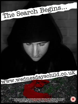
Since i thought it added tension and mystery to the character, also 'The Shutter Island' poster used the same colours as what our production consists of; red, black and white, this also let's the veiwer have an insight of what type of genred film it is, being a thriller/mystery. We thought as group, our posters should all consist of the same font being 'Courier new' on PC or 'American Typewriter' on the Mac. We decided to use these fonts since it links to liason officers because within films any investigators are stereotypically known to have a 'typewriter' or write in this text therefore we thought this would effective throughout our production. After adding the signifying text of the poem 'Monday's Child' linking to our film name 'Wednesday's Child', I used one the 'Artistic Brushes' to add smudges and dirtmarks around and on the text to make it look old and mysterious since it adds a bit of eeriness to the poster also linking back to the main charcter running away from the villin in the park, with her shoes getting muddy and dirty.

Paintshop includes various amounts of effects, such as 'skin smoothering' I used this to make Chloes skin glow and seem more pale than what it originally was, I also used this on the hair to blend into the black backing so the edges didn't look harsh.

Labels:

Movie Posters

As part of the advertising campaign made up of our main production and ancillary tasks, I have created one of the initial posters first attracting attention to our film. This poster is purposelly basic, including very little information and drawing in the audience to visit the website and find out more about the film itself. In our group, we all chose separate images to focus on so that our posters would not be too similar and would appeal to different audiences.


The image that I chose to focus on was that of the villain. He is not included so much in our teaser trailer, but to create cohesion he is wearing the same clothing, and using PaintShop Pro Photo X3, I have also dimmed the picture to create a darker feel to it. The white backed writing, in the cohesive 'American Typewriter' font shows the idea of text on ripped paper which I thought was fitting to our storyline and newspapers/police reports that we have looked into.


I have also incorporated the image of the scarf at the bottom of the poster. This brings in some of the key red colour that has been a huge focus throughout our production, as well as creating a sense of enigma and raising questions for all audiences.


Here is my final poster design:


Labels:

Monday 8 March 2010

Website Updates

When thinking about the areas that I would need to focus on to ensure that our own website will look professional, I looked through the ancillary task presentations created by my group, and also discussed with my group the things that we thought of as important to include in our own website. Eventually, we discovered that there are a few main areas that would need to be focused on to create an effective website for our production. These are as follows:

Images - Will need to include various different images ranging in shot types. I will also need to use an image editing programme such as Paint Shop Pro to create different image effects and to also build up an image of different layers to have an exiting and professional image.

Text - Will have to closely monitor the amount of text that appears on the website homepage. On most existing homepages, there is a very minimal amount of text used, so this research will reflect in my final homepage as this convention will have to be used. I will also look at the styles, colours and fonts of the text on the homepage, they will need to be the same throughout the website to create cohesion between each page making the final website effective and cohesive.

Hyperlinks - Websites contain hyperlinks, however, most professional websites use more comprehensive hyperlink styles. Image mapping is a method used to create different hyperlinks from different areas of the same image. I already have some basic knowledge of using image mapping and have decided to use image mapping on our website rather than using simple text links, as I think it will be a good way of making the website effective and professional, and will make the website of a higher standard.

HTML Formatting - Websites use HTML codes to create all different kinds of effects. Having some basic HTML knowledge, I thought it would be a good idea to use this knowledge to make the pages of our website more cohesive and professional. An example of the way I will be using HTML coding is by changing the colours of the scrollbars of the page. The colours I have selected are the same as the background colours, so this will make the scrollbars disappear, but will still scroll. This will make the website more professional as sometimes the presence of a scrollbar can change the overall look of the page.

Labels:

Friday 5 March 2010

iDVD

Whilst finishing our teaser trailer, to give it some authenticity, we decided to include a DVD menu with some special features. We found numerous software to create an opening to our DVD such as Microsoft Movie Maker which had some great features and ideas but we then resulted to using iDVD on Apple Mac.

iDVD, helped us customize our DVD. There were various amounts of themes to choose from to fit our genre of teaser trailer, from colours to fonts etc. We could add our own still photos and teaser trailer movie to the background, so our audience can view a snippet of the film making the viewer wanting to watch more.

We therefore chose to add to our DVD menu a close up image of our main character 'Chloe' in her symbolic red scarf, red shoes, pale skin and bright blonde hair. By adding a couple links also to our front page our viewers are able to look at different photos that were taken throughout the film and the main important link of teaser trailer. Also when entering our DVD menu the title of our trailer 'Wednesday's Child' scrolls across the bottom of the page in white lettering consisting of the same font throughout our media product 'American Typewriter'.

Labels:

Monday 1 March 2010

Photo Shoot

When looking into doing our ancillary tasks, we realised that we would need some new images as using ones from the film were just too poor quality. We wanted to use pictures for backgrounds and other smaller images so we needed some new, better quality photographs.

So i arranged a date with Chloe (our main character) to do a photo shoot. I took along props that we used within the film and also her original costume. I then shot various images in the locations that we chose.

I edited the photos by using the saturation tool to bring out the red and the light and shadow tool to make her and the background quite dull compared to the red.
After doing this we picked some of our favourite images:


Labels:

Sunday 28 February 2010

Posters & Magazine Cover Planning

In preparation for making our posters and magazine covers, we came together as a group and decided on the type of shots that we wanted for each ancillary task, and the colour schemes and layouts that we wanted.

We then realised that we would be needing various other shots of our characters for the backgrounds and smaller images, and so we arranged another photoshoot with Chloe as she was our main character. We brought in all of the props that we would be needing, as well as her costume, and Emily photographed her on the location of our shoot.

We could then sort through these collected images as a group, and decide on the best shots for the different products. We found that we could also use these images on the DVD cover, and on our website to create a strong cohesion between all of our products.

Labels: , , ,

Saturday 27 February 2010

Completed Teaser Trailer

We have now finished the filming and editing of our teaser trailer and it is ready to be burned to disc and uploaded to our blog. After we have created our ancillary products, we will then upload them and our teaser trailer so that they can be easily viewed.

Labels: , , ,

Thursday 25 February 2010

Editing Log

Throughout the process of editing our footage into our teaser trailer I have kept track of the hours spent editing by each individual in the group. The log below shows each date, the number of hours, and the group members present at the time. This system will help us divide the work more fairly and total the amount of time spent editing.

Labels: , , ,

Tuesday 23 February 2010

Finishing Touches

Aside from our main titles, we decided that we would add finishing touches to our teaser trailer such as the small-printed institutional 'Coming Soon' screen at the end of various other trailers. We hoped that this would give a real authenticity to our own production, and demonstrate the detail that we were focusing on.


Whilst some minor editing was being completed, I created this screen that we could then import to our footage and edit again with iMovie titles and transitions:


I studied other film trailer carefully to understand the type of information that I would need to include in the small print, and also to recognise the logos that were commonly used. I could then meet the conventions of a industry standard teaser trailer by adding our own information to the basic template.

Labels:

Wednesday 10 February 2010

iMovie

After the results from our audience feedback, we imported our footage onto the Mac's to use the iMovie programme. This would help us with our titles and transitions, as well as offering a wider range of fonts and better graphics as we finished editing the teaser trailer as a group.

After uploading our footage and naming our production, we could begin to split the clips in certain places to add in title screens where appropriate using the 'T' button on the right hand side of the panel. For the majority of our titles, we chose to use the same title style, and the same font - American Typewriter - to create cohesions. This particular font helped create the image of a traditional typed police report.

We could also strectch out our audio and change the fade duration in/out to control the rising tempo of our soundtrack during the institutional shots, as well as how quickly the music fades out at the end of our teaser trailer. Similarly, we could lengthen and shorten the black titled shots appropriately so that audiences would have enough time to read what was presented.

iMovie helped us to finish our production to a much higher standard, creating a cohesive and professional-looking teaser trailer. As well as being simple to use, it offered us a wide range of tools that we could experiment with to make the most of our final product.

Labels: , , ,

Monday 8 February 2010

Audience Feedback Changes

After looking at the main issues highlighted in our audience feedback, we began editing our production further to help it reach its potential as a teaser trailer.


The first issue that we dealt with was one of continuity. We made sure that the clip of Chloe on the swing did not appear after the one of the empty swing as it had before. This was fairly easy to change.


Next we had to deal with the issue of a rough outline being visible on a black screen. When we transported our trailer to the Mac, we did actually remove all of the black screens and replace them with title screens that we could adapt. This then solved the issue of the persons outline and made it look much more professional.

After we had added in the titles at the length that we wanted, we could then add in the text and graphics/animation that we wanted on them. This solved the problem of having little information in our teaser trailer. This also extended the length of our trailer, and we also added in some extra footage that we had not used to meet the conventions of a trailer (length-wise).

Once we had the full lenght of our trailer in place, we could then sort out any pacing and audio problems that we had found. We made the trailers pace gradually increase to create more enigma, and matched the audio more precisely to the action.

Lastly, we considered that our institutions may be too bright. We managed to put an effect over them to 'Cartoonise' them further. This actually blurred them slightly and made them seem less bright and happy than previously, which was much more effective.

We feel that we have considered all of our audience feedback and made the appropriate changes, along with several others, to make our teaser trailer meet the necessary conventions and be as effective as possible.

Labels: , , ,

Saturday 6 February 2010

Audience Feedback Results

Before we transported our production onto the Mac for further editing, we presented our First Cut to many of our peers (media students and also those whose media knowledge is not as advanced as our own), as well as many staff from our sixth form, and family members. This meant that we were covering a wide range of audiences.

We told them to analyse our production closely and tell us what was effective and what was not so effective about it. We could them take these suggestions and improve our teaser trailer, based on what our audience wanted.

Here are several of the issues found within our teaser trailers' First Cut by our Audience Feedback:
  • Continuity issues - There is an image of the empty swing, then later we go back to the swing with the girl present.
  • Black screen issues - At one point you can roughly see someones outline on a supposedly blank screen.
  • Pacing issues - There are a few issues with the increasing pace of the trailer, and it could become slightly faster towards the end for added enigma.
  • Titles & Text issues - Our First Cut currently has no titles or added text.
  • Institution issues - The institutional logos appear brighter than may be suitable considering the genre and tone of our teaser trailer.
  • Currently too short, even for a teaser trailer.

After considering all of these constructive criticisms we will begin work on our final production. We will then post updates of the changes that we have made due to this feedback from our audiences so that our progress can be seen clearly.


Labels: , , ,

Wednesday 3 February 2010

Audience Feedback

During the process of our editing we created a First Cut of our teaser trailer. This was the initial outline of our trailer to give an idea of what the final outcome would be. We presented this rough cut to our media class, members of staff, family members and our friends to get a real idea of peoples' responses to our work. This means that we would get feedback from a wide audience of different ages and both genders.

Results from our audience feedback process will be posted shortly.

Labels: , , ,

Friday 29 January 2010

Adobe Premier Pro.

The whole of our group was involved in the editing process, and therefore we have created an editing log showing this. For the main part of the editing process, we used the programme Adobe Premier Pro. before moving onto iMovie at a later stage.

After using Adobe in our AS year, we were all very familiar with the workings of the timeline and the different precision editing tools available, as well as the many audio and video effects and transitions. This helped us to work through the footage that we had collected - swiftly but thoroughly - to create a smaller amount of footage that we would later use for our teaser trailer.

Once this small amount of footage was in place, we could go about using the razor tool to slice it perfectly by zooming in on the timeline. We could then break down all of our footage and move it around the timeline with the cursor tool to change the ordering.

We could also unlink the original audio from the video and remove this, before adding our soundtrack to the trailer. This meant we could then focus on fitting the cuts and movement exactly to the tempo of the music. As well as this, we could add multiple effects to create different colouring in the shots, such as making the red particularly stand out against the wooded areas.

Once we had used all of the available tools to our advantage and created our First Cut, we could then, after audience feedback, transfer our production to the Mac's for iMovie to add titles and DVD menu's.

Labels: , , ,

Monday 25 January 2010

Soundtrack

In our foundation portfolio production we found it difficult to find uncopyrighted music to use as a soundtrack, and we also had no access to Apple Mac's at our sixth form. However, this year we have been much more fortunate with the Media department now having Mac's that we can use, and also a source for uncopyrighted music: Steven Scott (who will be credited).

After we had our main structure of footage, we played around with one of Steven Scott's tracks that we particularly liked, and cut it up into smaller sections of different tempos so that we could mix around the order and fade them together. We chose two main sections of the track: an upbeat section for the faster areas of the trailer, and a slower and much quieter section to help build tension. We then added this audio, as well as the pre-recorded audio of the newsreader to our rough structure so that we could edit the transitions to match up with the beat of the music.

We linked the faster paced sections of music to the shots in which we had altered the length and sped up the movements, and also to the sections in which our characters were running (disequilibrium). The slower sections we then added to the tension-building beginning of our trailer in the equilibrium stages, as well as at the end of the trailer as a fade out.

We could then finish editing our teaser trailer with more precision based on the soundtrack that we had altered from one of our uncopyrighted tracks.

Labels: , , ,

Wednesday 20 January 2010

Initial Website Planning

As a group, we spent one lesson in class deciding on the basic components of our website.

The basic pages our group decided to include are as follows:

- Homepage
- Synopsis
- Cast & Crew
- Gallery
- Downloads
- Soundtrack

We decided on a basic yet effective colour scheme of black, white, red and greys as this would create cohesion with both our teaser trailer and our other products (e.g. poster and DVD cover).

Here is the uploaded spider diagram of our basic group planning for the website...


We then combined our initial ideas of the homepage layout and came up with four possible designs:


After exploring Google Sites, we decided that we wanted to use Macromedia Dreamweaver (See Emma's previous post about Google Sites) to create our homepage, so I set about creating the pages we had decided on. I then set up a title area and left hand menu system on all pages, and created working hyperlinks between the appropriate pages of the website. After changing the colour of the backgrounds I added in basic titles that can be changed at a later date if necessary.

When the website homepage is completed, I will take screenshots and upload them to our blog to show the final design of our own homepage.

Labels:

Friday 15 January 2010

DVD Cover

Having a DVD cover is an essential to any film since it advertises the product, therefore we thought it is a must. As you can see below is our finished DVD Cover


I created the DVD Cover by using Adobe Photoshop CS5 this abled me to edit and add effects to our DVD cover i included all our institutional information, certificate, title of film, quotes, DVD bonus feature, Specifications etc, all the forms and conventions of a real DVD Cover. I tried to make a authentic and genuine as possible trying to keep to the same colour scheme as all our ancillary products.

These are the variety of photos i used within our dvd cover to give it an authenticity of our film and of a genuine DVD cover.

CHLOE WITHIN FOREST


DISTORTED CHLOE RUNNING


ABANDONED SWINGS


I used different all the different images above since I thought they all showed loss and isolation, because of the location displaying lots of open scenery and also the vulnerability of our protagonist running away, looking back at the camera.

Labels:

Tuesday 29 December 2009

Intertextuality in our Production

When planning our production, we studied intertextuality and so looked into our own intertextual references. Looking at our product throughout the editing process, some of these have become particularly clearwhen looking at some of the films that we have studied as part of our research. The most obvious use of intertextuality is through the use of colour as a form of representation.


This colour usage can be found in many films produced over recent years: Schindlers List (1993); Unbreakable (2000) and The village (2004).


All of these films have chosen to use colour (particularly red) to draw attention to certain aspects of shots. In our production, we have eclectically borrowed the idea of using colour to draw attention to our female (child) protagonist, specifically choosing the colour red to represent the theme of danger. The image from Schindler's List was one that we particularly referenced when planning our production; the idea of the young girl in the red coat is very similar to our footage. However, the use of the colour in contrast to the dark forests in M. Night Shyamalan's The Village, is another aspect we have chosen to focus on as the main setting of our teaser trailer is the woods.


Aside from the intertextuality in the form of colour usage, aspects of our plot are also referenced to other texts. For example the kidnapping storyline could be connected to Gone Baby Gone (2007) - this particular films UK release was postponed due to it's similarities to the Madeleine Mccann case, which is something that we have been particularly careful and senisitve in avoiding reference to - or Taken (2008), which focuses on a much older female being kidnapped, but is based around the same idea.


Although intertextuality appears throughout our production, all of the main plot ideas and shot types that we have used have been our own, and we have only borrowed ideas from certain aspects of other major productions.

Labels:

Saturday 19 December 2009

Completed Filming - Shooting Schedule

Below is a photo of our completed shooting script as we have now finished filming the necessary footage for our teaser trailer. This shows the dates we filmed each section; the locations; the cast and crew present and the costumes and props necessary.

Labels: , , ,

Completed Filming

Now we have collected all of the necessary footage for our teaser trailer, it is time to move on to the editing stage of our production. For this, we will be using a combination of different programmes such as Adobe Premier Pro on Windows, and also Garageband and iMovie on Macs.

As we begin to use these programmes in our A2 year, we will update our progress in posts and also explain how we have explored different techniques and tools that we did not last year, or we did not have access to (having only gained access to Mac's in our A2 year).

Alongside our editing, we will now also begin work on our ancillary tasks.

Labels: , , ,

Friday 18 December 2009

Viral Marketing

A lot of people, especially our age, spend a lot of time on social networking sites such as Facebook and YouTube. Therefore viral marketing would be a good idea to help in promoting our film.

One of the films that did this and in doing so achieved considerable awareness was The Dark Night. They began their viral marketing process by utilizing the film’s tagline “why So Serious?” and also launching an official website featuring the fictional political campaign of Harvey Dent, with the caption “I Believe in Harvey Dent”. The site was expected to interest fans and have them participate in online puzzles and games. One of these included fans to send e-mails and as they did pixels would be slowly removed, revealing the first official image of the joker; it was ultimately replaced with many “HaHas” and hidden messages that said “see you in December”

Including puzzles and games within our website could be a possibility as I like the way that fans can get involved and be excited to see what’s going to happen or what they are going to see next. But at this stage we wanted to focus more on Facebook pages ECT and hopefully these pages will, in time, advertise our website.

Another film that tackled viral marketing was Cloverfield.

They began by making each character create a MySpace page advertising the film. The main attraction on these pages was the teaser trailer. But the name of the film was not featured in this. Fans become aware of this and the unnamed film began to be discussed all over the internet; on blog’s and many more networking pages. This led to more fans. After this a website was released and puzzles and games were featured the same as The Dark Night.

I think the way that Cloverfield built up their fans and then released a website was effective. Hopefully when marketing our film we can follow in similar footsteps as it seems to work.

Viral marketing obviously can play a big part in making different audiences aware of new films. The internet attacks so many different demographic groups allowing maximum awareness.

Viral marketing is definitely something we will be doing.

Labels:

Saturday 12 December 2009

Final Casting

As we came up to the final stages of our filming, we finalised our cast list which became as follows:

  • Child - Chloe Hill
  • Villain - Russell Denny
  • Mother - Emily Wright
  • Father - Sam Morris
  • Female Police Officer - Elizabeth Boulamatsis
  • Male Police Officer - Steven Bourner
  • Newsreader - Alexandra Watt

Labels: , , ,

Wednesday 9 December 2009

Ancillary Products

When discussing how we would spread the work for our ancillary products, we decided that Amy would take on the majority of the work concerning our website, with input from the rest of the group. This then left us with posters and magazine covers. We decided that Emily, Elizabeth and I would then divide the workload of these remaining products between us with input on planning from Amy. We would all individually sketch designs for each, and then bring these together to create our final products.

We agreed that this would make an equal spread of workload as we would all be involved - whether in a small or large role - in all aspects of the ancillary tasks. We also decided that, as Amy was taking on a large task in our website, we would create a series of posters, and possibly several magazine covers so that we were having an equally sized role.

Labels: , , ,

Saturday 5 December 2009

Magazine Cover Designs

Before creating our magazine cover featuring our film, we all individually sketched some ideas for our group production and brought them together to create the best/a mix of them. Below are our rough individual sketches and short explanations of why we have used certain conventions:

Emma:


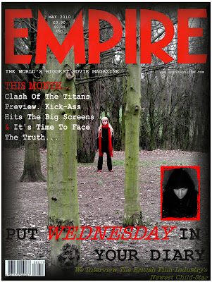
For my design, I chose to focus on the use of Empire Magazine as this is a well known production that would well advertise our film. I also thought the traditional red font of the magazine title would fit in well with the ideas that I had for it.
In my sketch I have included the magazine title at the top, and run the film title 'Wednesday's Child' across the middle of the cover. I have also included the traditional convention of a barcode, price and issue date on the bottom left. Along the bottom of the cover, I added a banner advertising smaller articles included in this issue of the magazine, and have included other titles at the edges of the page advertising the larger articles as typical of a film magazine.
The colour scheme that I imagine is mostly dark with the exception of the headings and the girl in the centre of the cover. Cohesive with our trailer, she would be depicted wearing red to demonstrate the danger, which will stand out against the dark surroundings. The cover in general will be very dark and full of shadows to portay the mystery-thriller genre.


Elizabeth:


My sketched design for the front cover of a magazine consisted of the basic conventions of any film magazine. Therefore, within my design I used the header and layout of the internationally-known film magazine 'Empire' since it would advertise our production very well and result in a wider audience income. The use of the colours of text throughout my design consists mainly of black, red and white. This fits in well with the red header of 'Empire' since it doesn't look out of place. I've included in my design an image of the main character, centred in the middle of the page so that the young girl looks lost withing the busy scenery surrounding her. I tried to use different locations that we used within our filming such as the trees, grass, leaves and muddy footprints from the forest, the pink rug from her girly bedroom, as the backing to make the character seem more eye catching since the blonde hair, pale skin, and red clothing signifying danger gives our audience clues to the mystery/thriller genre. I added the various traditional conventions such as a barcode, price, extra banners advertising other films coming soon, and a subheading 'Monday, Tuesday.. Child?' linking to our film, also by including '... child' instead of the actual name of the trailer adds even more tension, making our audience want to know more.


Emily:


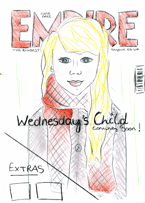
For my front cover I have tried to design an image that is in cohesion with our trailer. I have chosen Empire magazine to promote our film as its one of the biggest and successful magazines and would hopefully be the best choice in order to advertise our film. I am going to keep in the typical conventions of the magazine; using the red EMPIRE title with the tagline below, date and price between the M and a barcode. For my design I have chosen a close up image of our main character (Chloe) as the background, with our title 'Wednesday's Child' in the centre. I have also left a triangle shape in the bottom corner in order to place plugs as other extras within the magazine. When designing it I wanted to keep to a colour scheme which consists of: Red, white and grey tones.

Labels: , ,